 |
| EXAMPLE OF A LEVEL STUDENT WORK |
The above digipak uses a theme of red, black and white; this makes the digipak stand out from others that I have seen. The colours used are rather simple but effective at the same time. The images remain consistent throughout, keeping the same theme and some run over two sides of the cover. The main album title is placed at the top in a style of typography which makes the images stand out first.
 |
| EXAMPLE OF A LEVEL STUDENT WORK |
This digipak above uses quite a lot of colour which makes it appealing. The light, pastel colours contrast with the black colour used on some sides of the cover creating a rather dis-jointed feeling. The images seem to be the main focus point on this digipak as the typography used is rather small and difficult to see, this creates the impression that the person who designed this digipak wanted the images to stand out and be the main point rather than the titles and information.
 |
| AN EXAMPLE OF A LEVEL STUDENT WORK |
This digipak is for one of Rhianna's albums 'Loud'. An aspect which makes it appealing is the fact that the person who designed this was persistent in keeping the theme and style throughout the entire digipak. The image used on the inside cover is one image which runs over the 3 sides, creating a very complete and definite feeling. This digipak looks of good quality and clearly shows who the artist is and what the album is called.
 |
| EXAMPLE OF A LEVEL STUDENT WORK |
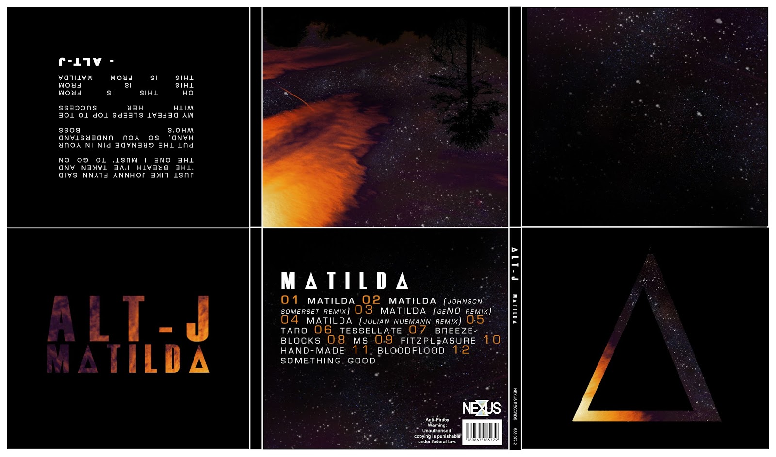
This digipak has an evident colour scheme that runs throughout the entirety of it. The typography used allows the album title and track list to be seen easily and clearly. The front cover features the album title and artist only, placed on a black background, this is really effective in making the title stand out before opening up the digipak and seeing the other information and galactic style imagery.


No comments:
Post a Comment